Last night I posted what is my all-time favorite color scheme. It then occurred to me that not everyone knows what to look for in a color scheme. It’s mostly a matter of taste, but there are essentials.
Minimal Eye Strain
The reason we look to switch color scheme’s in the first place is that the high contrast of the default dark colored and black text over white puts a strain on the eye when looking/reading for a prolonged period of time. High contrast is great for readability, but there is such a thing as too high.
The solution is very simple. The majority of the screen should be dark. With code, the majority of the screen is background. Now, the "Black" vs. "Muted color" is up to you. Black will have a high contrast as well but will make most colors, muted or not, pop-out as much as the default dark over white scheme. You will see if a scheme’s contrast is tiring or not by using it.
Touch of Color
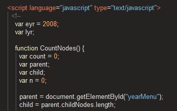
I don’t know anyone that stuck to Notepad for coding after seeing their code "color-coded". With color, you can quickly see the difference between parameters, identifiers, keywords, etc. Heck, depending on the IDE and the color scheme, you can sometimes see syntax errors.
Like a lot of things in life, balance is key. Programming languages have many different elements, even more if you work in Web Development and can have HTML, CSS, JavaScript and PHP at once on screen. Even though everything can be of different colors, it may not be essential. Some schemes are very colorful, some have grouped some elements together.
My Ultimate Readability
Ultimately, only you can see if a color scheme works for you. Some like light text over dark background, some like it the other. Some like high contrast, some like good/medium. What I prefer is what makes the most sense if you understand how we see color and how the eye works: Dark earthy background, slightly muted, and muted (a little more saturated) color for the foreground text (code). This assures a somewhat high contrast, though not maximal, and a dark background.
Obsidian, Putty, Selenitics, Twilight and Zenburn are just a few that walk the line of balance of great but not maximal contrast and just a touch of color.